Some thing just have to be scaled for television.
Author George R.R. Martin’s sweeping, epic fantasy tale called “A Song of Ice and Fire” that was eventually turned into the mega-hit HBO show Game of Thrones is a perfect example of this.
The show is already one of the most expensive productions on all of televisions, but the payoff is the fact that Game of Thrones is hugely popular, brings in millions upon millions of viewers and might just be HBO’s best drama since The Sopranos left the airwaves a few years ago.
Still the vision that any author has of his or her own work is going to look a little different on someone else’s pallet and such is the case with Martin’s idea of what the infamous Iron Throne should look like.
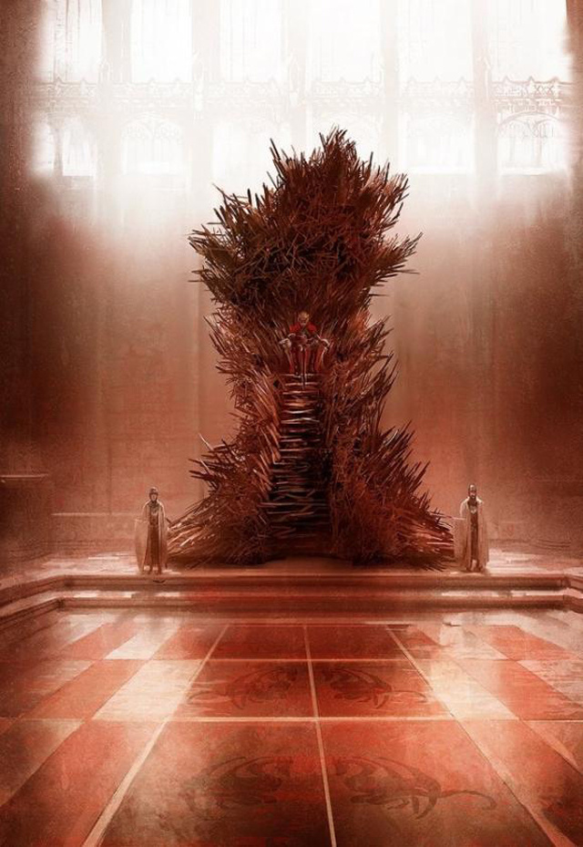
Martin recently took to his blog where he revealed a picture done by artist Mark Simonetti (who is also responsible for the Song of Ice and Fire calendar) of what the real Iron Throne would appear like if done to proper scale based on his original books.
The HBO throne has become iconic. And well it might. It’s a terrific design, and it has served the show very well. There are replicas and paperweights of it in three different sizes. Everyone knows it. I love it. I have all those replicas right here, sitting on my shelves.
And yet, and yet… it’s still not right. It’s not the Iron Throne I see when I’m working on THE WINDS OF WINTER. It’s not the Iron Throne I want my readers to see. The way the throne is described in the books… HUGE, hulking, black and twisted, with the steep iron stairs in front, the high seat from which the king looks DOWN on everyone in the court… my throne is a hunched beast looming over the throne room, ugly and assymetric…
The HBO throne is none of those things. It’s big, yes, but not nearly as big as the one described in the novels. And for good reason. We have a huge throne room set in Belfast, but not nearly huge enough to hold the Iron Throne as I painted it. For that we’d need something much bigger, more like the interior of St. Paul’s Cathedral or Westminster Abbey, and no set has that much room. The Book Version of the Iron Throne would not even fit through the doors of the Paint Hall.
Without further ado here is the vision of what the real Iron Throne should look like:
Martin goes onto say that as long as he’s writing the books (still a couple of more to go George!) this is what his vision of the Iron Throne will look like in his mind’s eye.
That’s the Iron Throne as painted by the amazing Marc Simonetti (and if you haven’t gotten his 2013 Ice & Fire calendar, better hurry, the year’s half over) for the upcoming concordance, THE WORLD OF ICE & FIRE. It’s a rough, not a final version, so what you see in the book will be more polished. But Marc has come closer here to capturing the Iron Throne as I picture it than any other artist to tackle it. From now on, THIS will be the reference I give to every other artist tackling a throne room scene. This Iron Throne is massive. Ugly. Assymetric. It’s a throne made by blacksmiths hammering together half-melted, broken, twisted swords, wrenched from the hands of dead men or yielded up by defeated foes… a symbol of conquest… it has the steps I describe, and the height. From on top, the king dominates the throne room. And there are thousands of swords in it, not just a few.
This Iron Throne is scary. And not at all a comfortable seat, just as Aegon intended.
Martin also revealed recently that a special edition Game of Thrones comic book will be released in limited edition at San Diego Comic Con. The Game of Thrones panel will take place next Friday July 19 and the Nerdcore Movement will be front and center for any of the news that comes from the upcoming convention.

